Case StudiesCannabis Equity Illinois Coalition
Rebuilding the Coalition's website to ensure easier access to cannabis equity resources
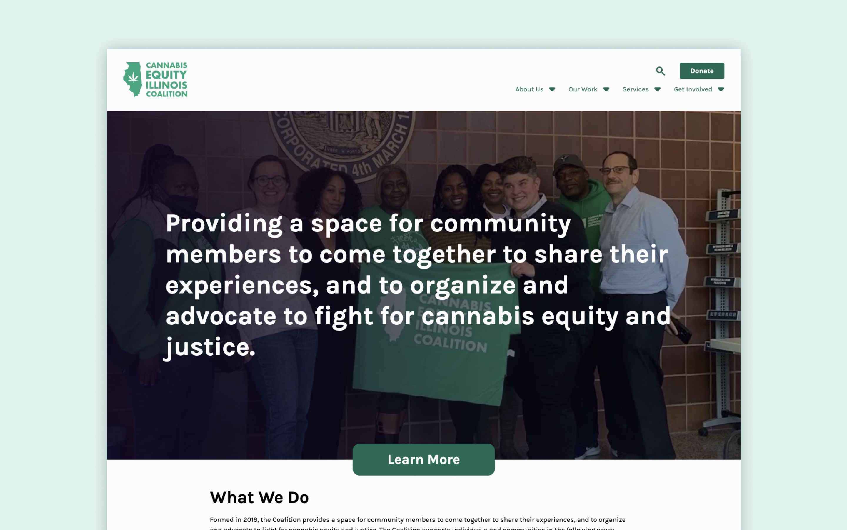
Overview
Code for Chicago
Code for America is a non-partisan, non-political 501 organization founded in 2009 to address the widening gap between the public and private sectors in their effective use of technology and design. Through Civic Tech, our work can bridge the gap between nonprofits and technology. Code for Chicago operates as a pro-bono digital consultancy. Code for Chicago identities the needs of the community and partners with local organizations for Civic Tech projects. These roles include, but are not limited to: Developers, UX/UI Designer and UX Researchers.
Cannabis Equity Coalition Illinois
Founded in 2019, the Cannabis Equity Illinois Coalition is a grassroots nonprofit that advances equity in the State of Illinois by elevating community voices and collaborating with partners to create change in the cannabis industry.
They fight to make sure the legalization of cannabis in Illinois repairs and reinvests in the communities most impacted by the War on Drugs, and to ensure the cannabis industry prioritizes people over profits.
The Challenge
The Cannabis Equity Coalition Illinois (the Coalition) has been a long-time partner of Code for Chicago, with our team designing the Coalition’s original website that launched in 2019. As time went on, however, the Coalition outgrew their website and found themselves employing less-than-ideal user experience methods in order to make the site work for their needs. In 2021, a new team of designers, researchers, and developers were tasked with re-thinking the Coalition’s website to better fit the growing organization.
Our Approach
The team recognized the need to fully understand the unique user groups and conducted 10 user interviews with Coalition board members, staff, and members. After learning more about the types of people who would be accessing the website, the team worked to build a refined information architecture rooted in accessibility and ease of use for all defined user groups. Once approved, the information architecture served as a foundation for wireframing 13+ unique pages organized into 4 groups. During this time the team also worked to establish a design system in Figma built with scalability in mind. Leveraging the design system, the cross-functional team including designers and developers worked to create components the Coalition could easily build upon after handoff. The final website was built using these components and was moved from a WordPress site builder to a new content management system for easier customization and management.
Project Timeline
February 2021 - May 2023
Problem Statement
The Cannabis Equity Coalition Illinois’s website was outdated and wasn’t meeting their growing membership needs, wasn’t scaling to add new programs and partnerships, and was developed on a platform that made ownership by the Coalition cumbersome.
The Process
Understanding the users
To begin, the team quickly realized there was a need to fully understand who may visit the Coalition’s website and what type of information they might be looking for. In order to dive deeper into the desires of the website users, the team conducted a series of interviews with potential users including: Coalition staff, Coalition members, prospective grant writers, partners, and community members who may utilize the website for resources.
After speaking to the Coalition website’s current and potential future users, the team organized the findings into user personas which were leveraged as we continued further in the design process.
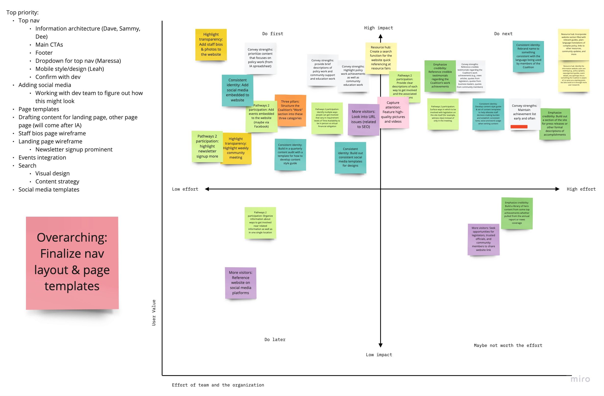
Crafting the information architecture
One of the largest issues with the original website was that it was simply difficult to find important information. The main navigation lacked governance around what should or shouldn’t live there, resulting in little sense of hierarchy to aid in organizing information. After understanding more about what information the Coalition wanted to surface to its members and what information potential members or grant writers would be looking for on the website, the team felt confident beginning to build out a more structured information architecture.
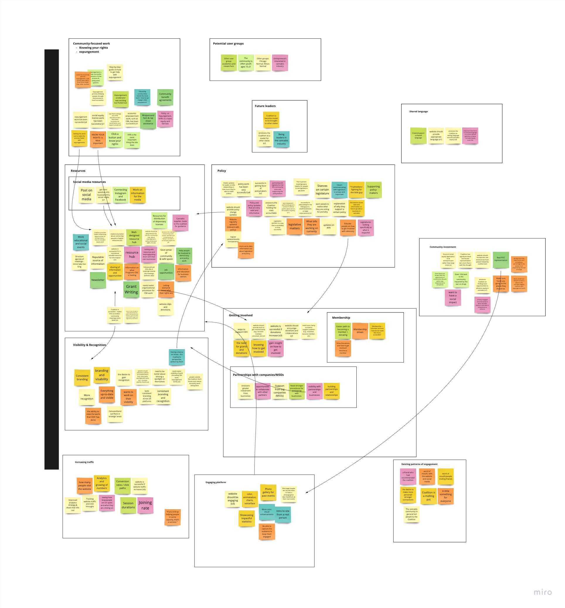
Our content designers took both current and prospective pages of information and grouped them by similarities and importance. This activity not only served as a necessary first step in refreshing the website, but also helped build a roadmap the team leveraged to stay on track.
Once the team knew the general roadmap of what pages of information to update and create new, the content designers, along with UX designers and researchers, worked to create page templates to collect content information and receive approval from Coalition stakeholders. Once approved, the team began designing low-fidelity wireframes to aid in feedback-gathering.
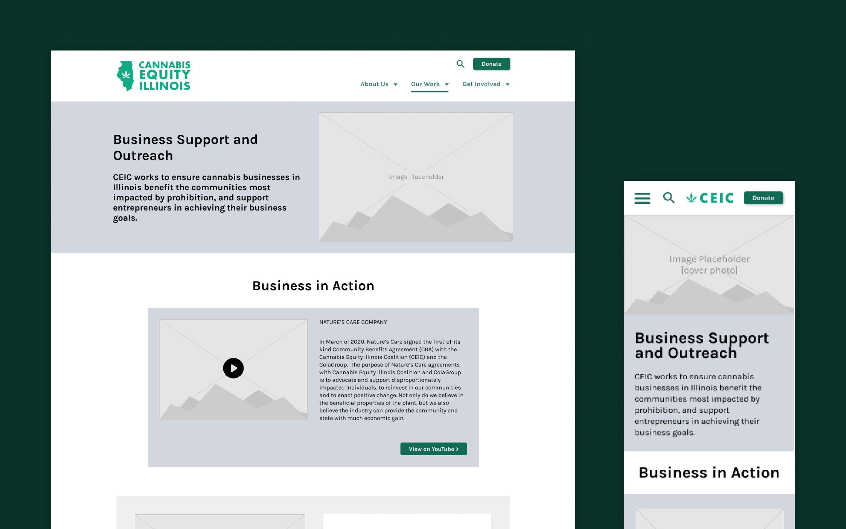
Expanding the design system
Quickly after beginning on the project, the team knew the original design system the Coalition was leveraging would need an update. After taking the necessary time to learn user needs and rebuild the information architecture, the team was able to take a deeper look at how to update the design system to expand with the Coalition.
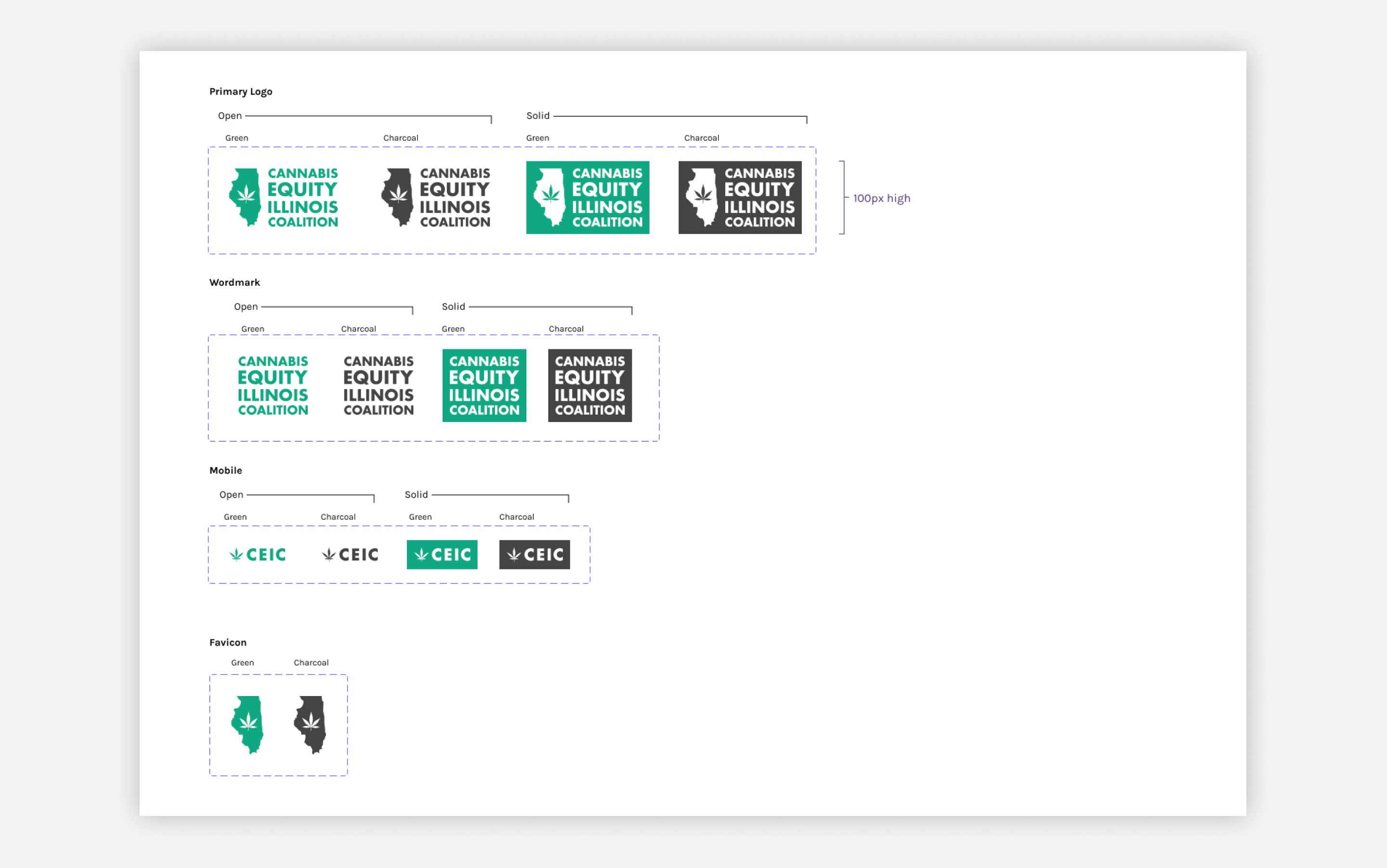
Keeping in mind the established brand the Coalition utilized for the past few years, the team tweaked the original style guide to follow accessibility guidelines and allow for more variation in color. The biggest undertaking, though, was building out a completely new design system leveraging Figma’s components, text styles, variables, and various other meticulous details. This new design system allowed the team to build off of the low fidelity wireframes and copy templates with a rapid pace and consistency across pages.
Building the components
While the designers were working creating high-fidelity versions of the new Coalition website over a period of many months and one day-long hackathon, the developers were working to move the original website off of a clunky Wix content management system onto a more robust and straightforward system.
Through design reviews and weekly check-ins, the pages were built in the new content management system with the completely new style guide and design system. In building these pages, the developers leaned into the high-fidelity designs and created a modular system of components from scratch that allowed the Coalition to build their own website pages in a fast and efficient manner.
Setting up for success
As the project comes to an end, the team is working to hand off ownership of the website to the Coalition and will provide documentation on the new style guide, design system, and content management system.
The new Coalition website was built with not only its future users in mind, but also its future builders. Code for Chicago’s collaboration with the Coalition over the past two years has set the future of the Coalition’s website up for success through careful explanation, planning, and communication on any changes and updates.
Outcome
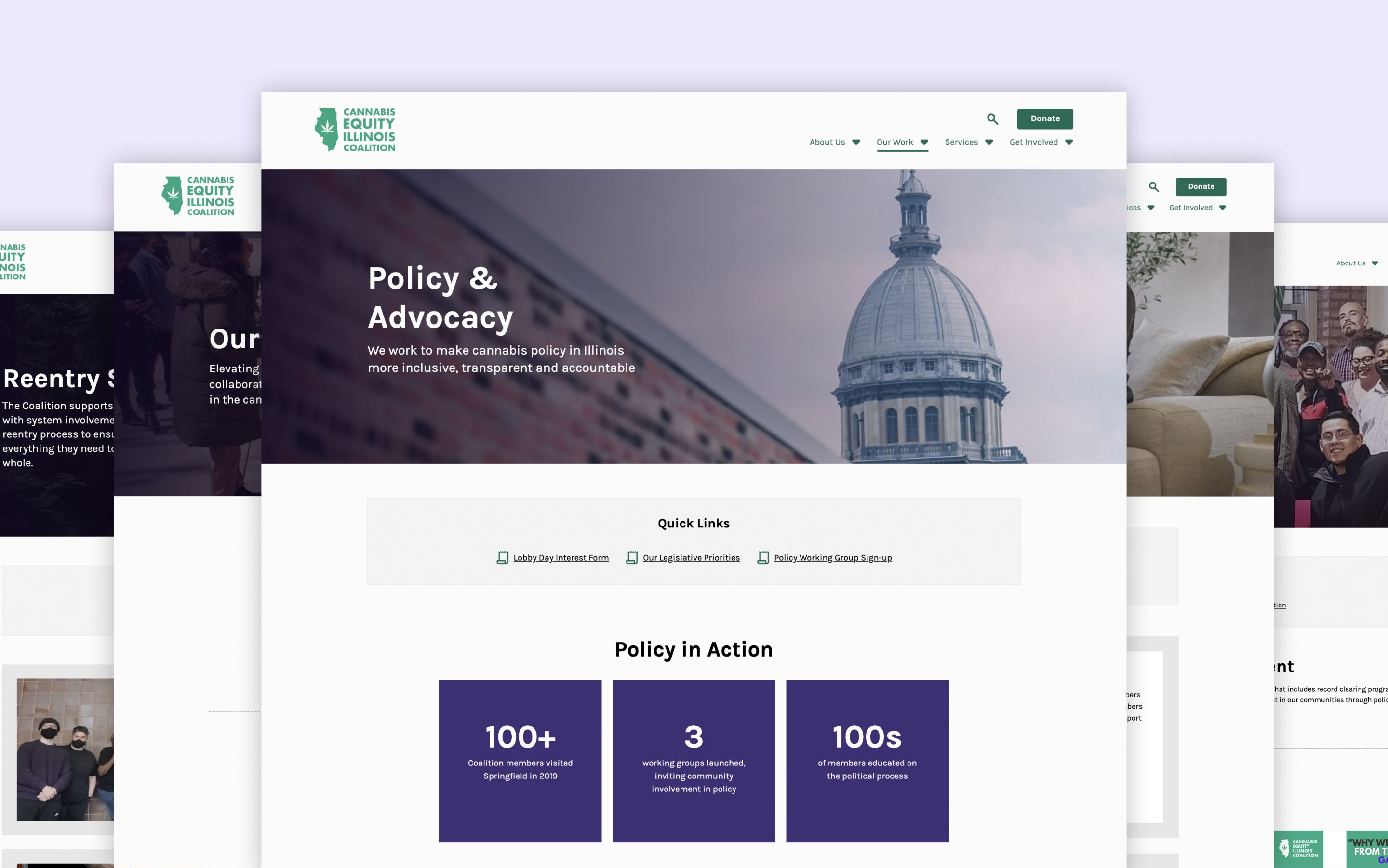
As one of the longest partnerships in Code for Chicago history, the continued support of the Cannabis Equity Illinois Coalition spans many years and many team members. The new website is a testament to the hard work and persistence of the team over two years, and Code for Chicago is honored to collaborate with and support the incredible work of the Coalition for years to come.
Team Members
Thank you to our Code for Chicago website team members throughout the years. This project wouldn’t have been a success without each and every one of your contributions.
Peter Contos - Coalition Product Owner Dave Pickett Nick Dolf Madison Ross-Ryan Leah Lehnhard Dee Marsden Marissa Pinzini Sammy Levy Joseph Tajaran Ryan Koch Amanda Treutler Belinda Mitchell Brandon Albright Davey A David Wallace