Case StudiesChicago Defender Charities (Website Development & Brand Design)
Identify a technical solution that fits the partner's use case and developing/designing a new brand and website.
Overview
Client
The Chicago Defender Charities (ChiDC) was founded by the late Chicago Defender Publisher John H. Sengstacke in 1945 as the charities’ arm of the Chicago Defender. Its focus is the African American community with production of the Bud Billiken ® Parade as its primary mission. In addition to the parade, the Chicago Defender Charities oversees a scholarship program, Bronzeville Life, and education programs.
The Challenge
Identify a technical solution for where the website would live, establish new brand guidelines, and design/develop a website.
Approach
Facilitate discovery workshops, user research, conceptualize IA, establish brand guidelines, and develop the website on the identified technical solution.
Project Month/Year
April 2021 to March 2022
Problem Statement
Currently, users can find out about Chicago Defender Charities through Mightycause, the Bud Billiken Parade, Bronzeville Life, and Facebook. While these websites and platforms communicate a portion of what they do, they fail to express their full breadth of services and mission to the community.
Additionally, what they currently don't have is any branding standards for their organization. What we needed to find out is how they want to communicate their brand and how we can plan for the future as they begin to scale.
Our Approach
Facilitate a series of workshops internally and with the partner to identify a technical solution that best fits their use case. Afterwards, facilitate discovery research to identify stakeholder goals for the site. Then, conceive the IA, early wireframes, validate ideas, establish brand guidelines that will conceptualize the site’s UI. Finally, develop the website on the identified technical solution: Squarespace.
Methodology
Discovery Workshops
At the onset, it was clear that ChiDC wanted the Code for Chicago team to build a website for them. What complicated this was their desire to place all their websites (Bud Billiken and Bronzeville Life) into one platform. Hence, the team facilitated a series of internal discovery workshops to identify an appropriate research method to help us solve this problem. The team went through IBM’s Enterprise Design Thinking Practitioner and Co-Creator courses. For a mixed experience team, this was a great way to build mutual understanding of how to approach UX Design.
Since the team didn’t have a full understanding of the partner’s use case, it was decided that a series of stakeholder interviews would be the best research method to solve this problem. After facilitating these interviews the team learned that Squarespace was a technical deliverable that best fit their needs. Although this seemed like an easy solution on the surface, the discovery workshops helped identify the best research method for this problem, and the team/partner could make a more informed decision.

Early Ideation
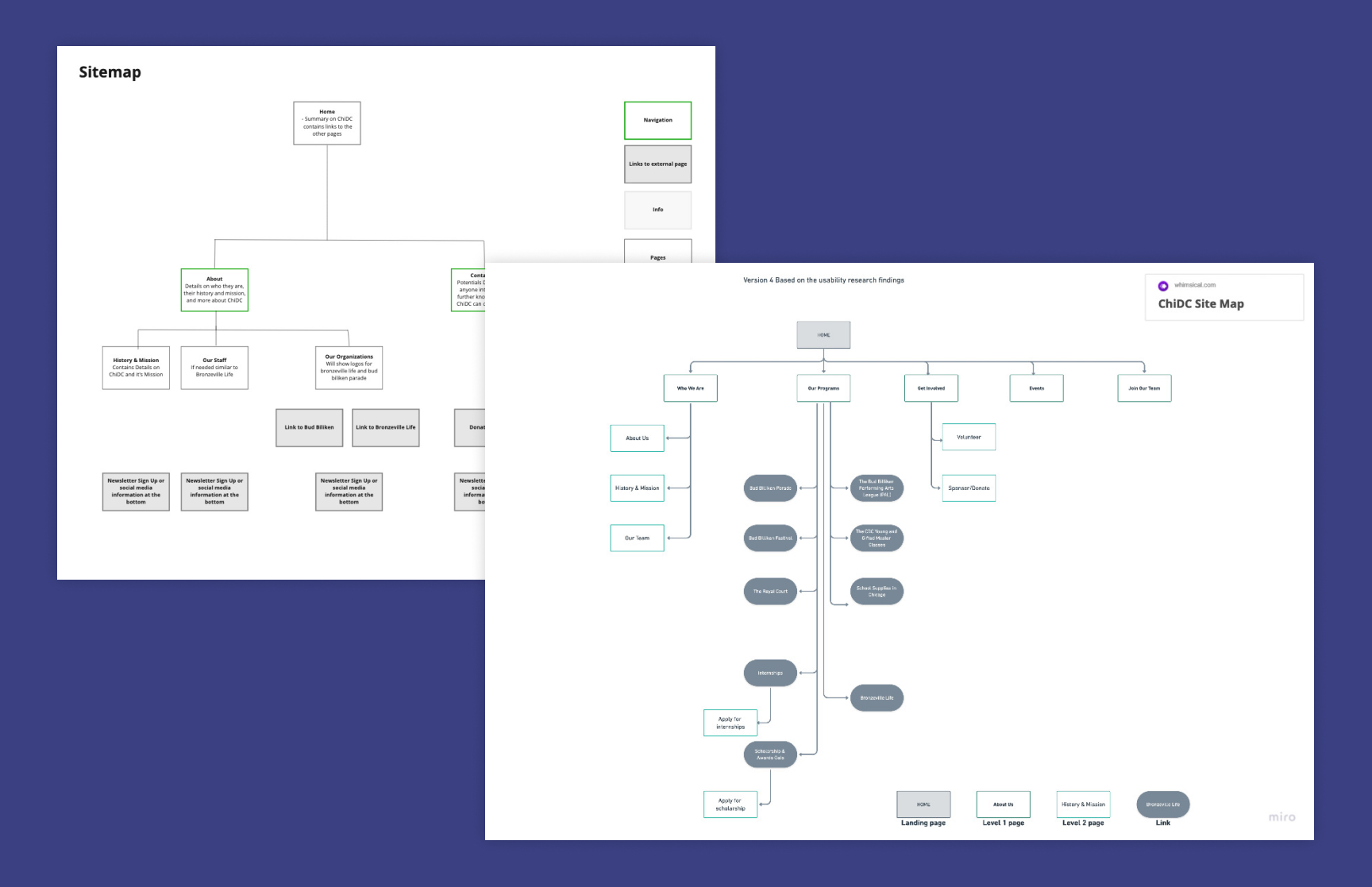
Now that the team knew where the website would live, next was to figure out how it was going to be structured and how to map their use cases on specific pages. First, the team identified user personas, which later helped with recruiting potential users for a card sort activity.
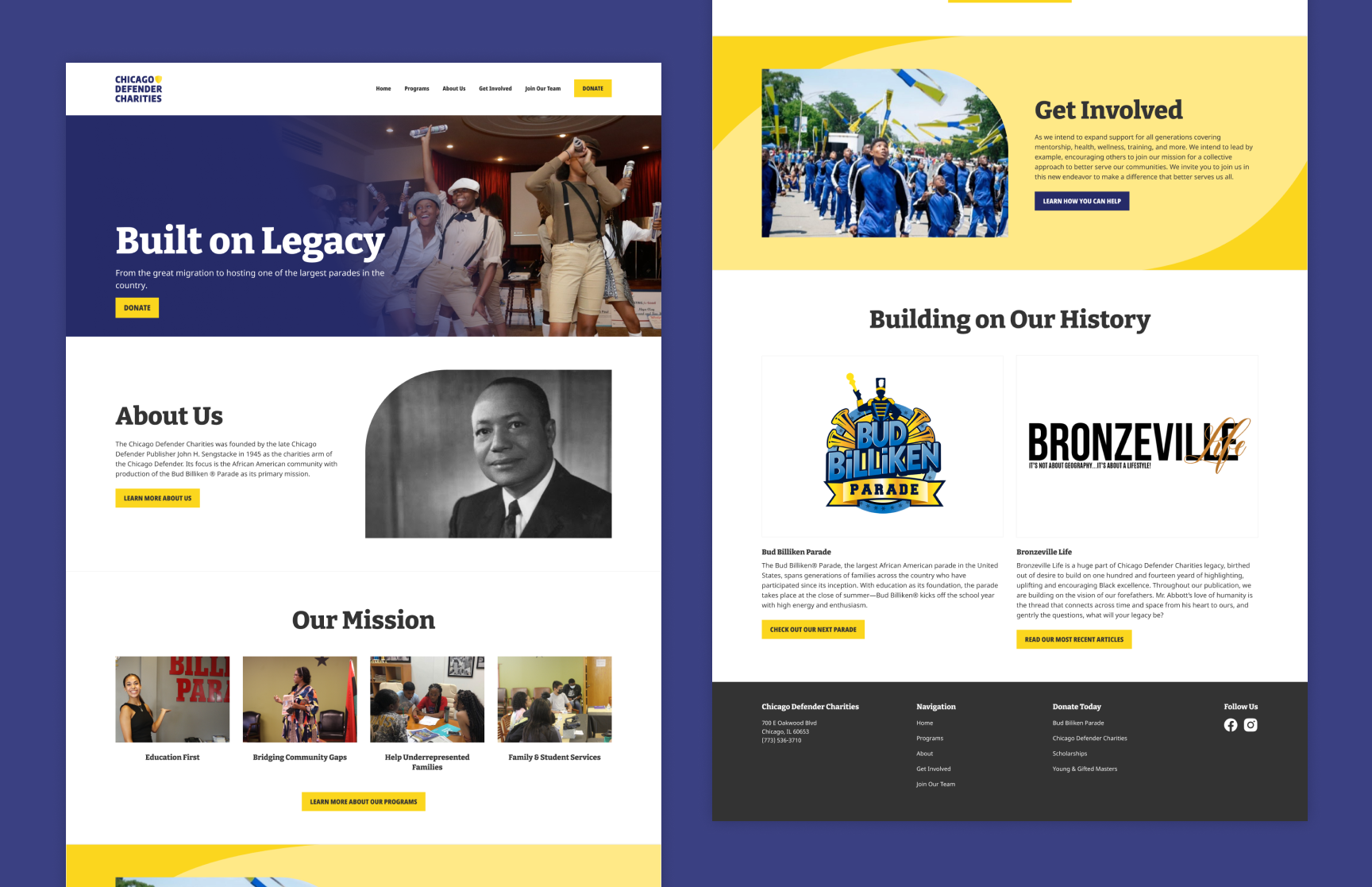
While the website’s information architecture was being explored, the team leveraged the previous research’s identified use cases and designed low-fidelity wireframes. For example, one of the problems the partner frequently faced was the misunderstanding that all they did was host the parade. One solution the team surmised from this finding was identifying a place to communicate all their programs. Hence, the team designed a “Programs” page that was iterated through partner feedback. The other identified problems and use cases had a similar treatment to the programs page.
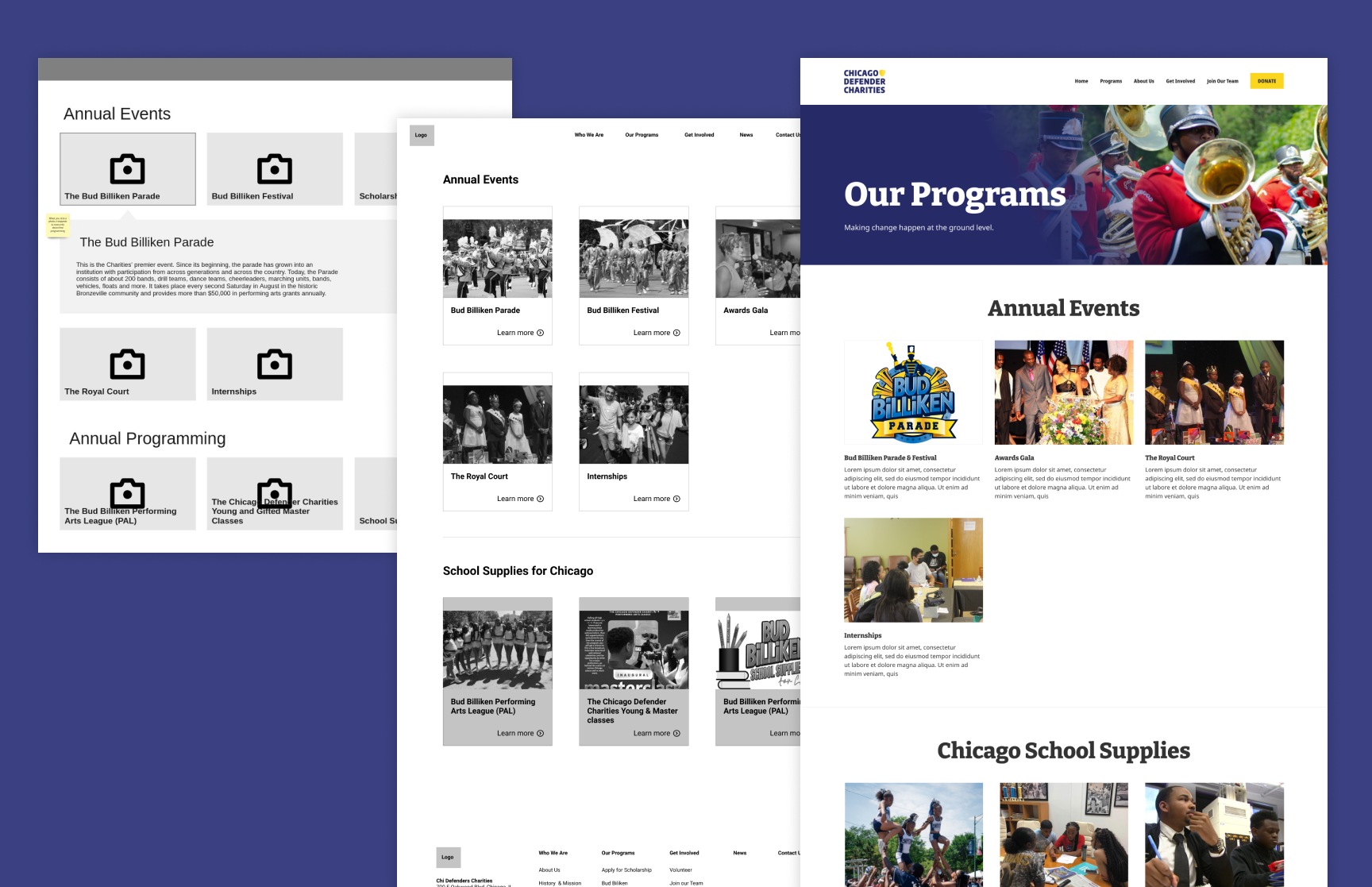
Once the team completed the card sort activity and identified what needed to be on each page, next they wanted to identify if users could find what they were looking for. Additionally, the partner had a business goal of increasing donations so the team facilitated user interviews to gather more insight on how the website can be utilized to increase donations. Hence, the research study consisted of a first-click test and user interviews.
Brand & UI Design
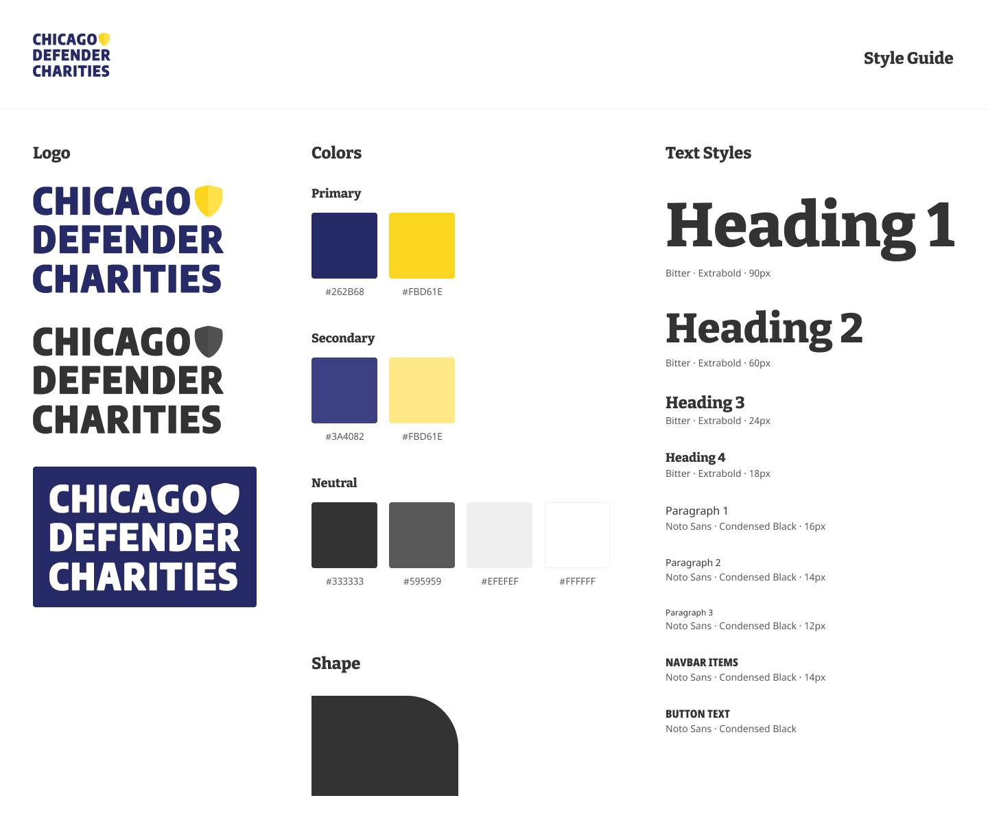
A branding exercise kicked off this portion of the project. The team facilitated a workshop with the partner, in which the team identified four keywords that best describe the ChiDC brand. Using the identified brand words, the team sourced visual inspiration from the websites of similar non-profit organizations and through Pinterest. This research informed initial color and typography explorations.
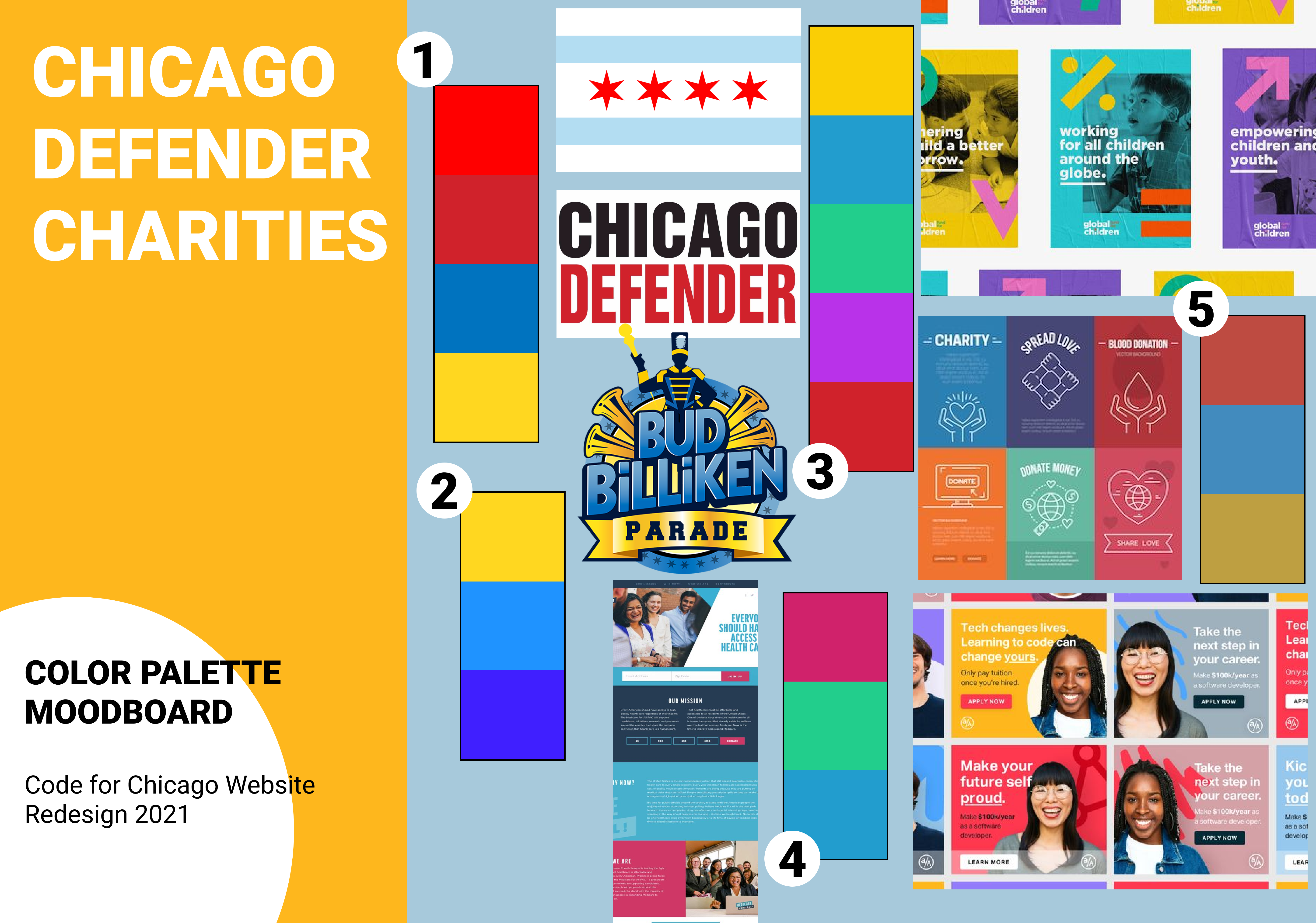
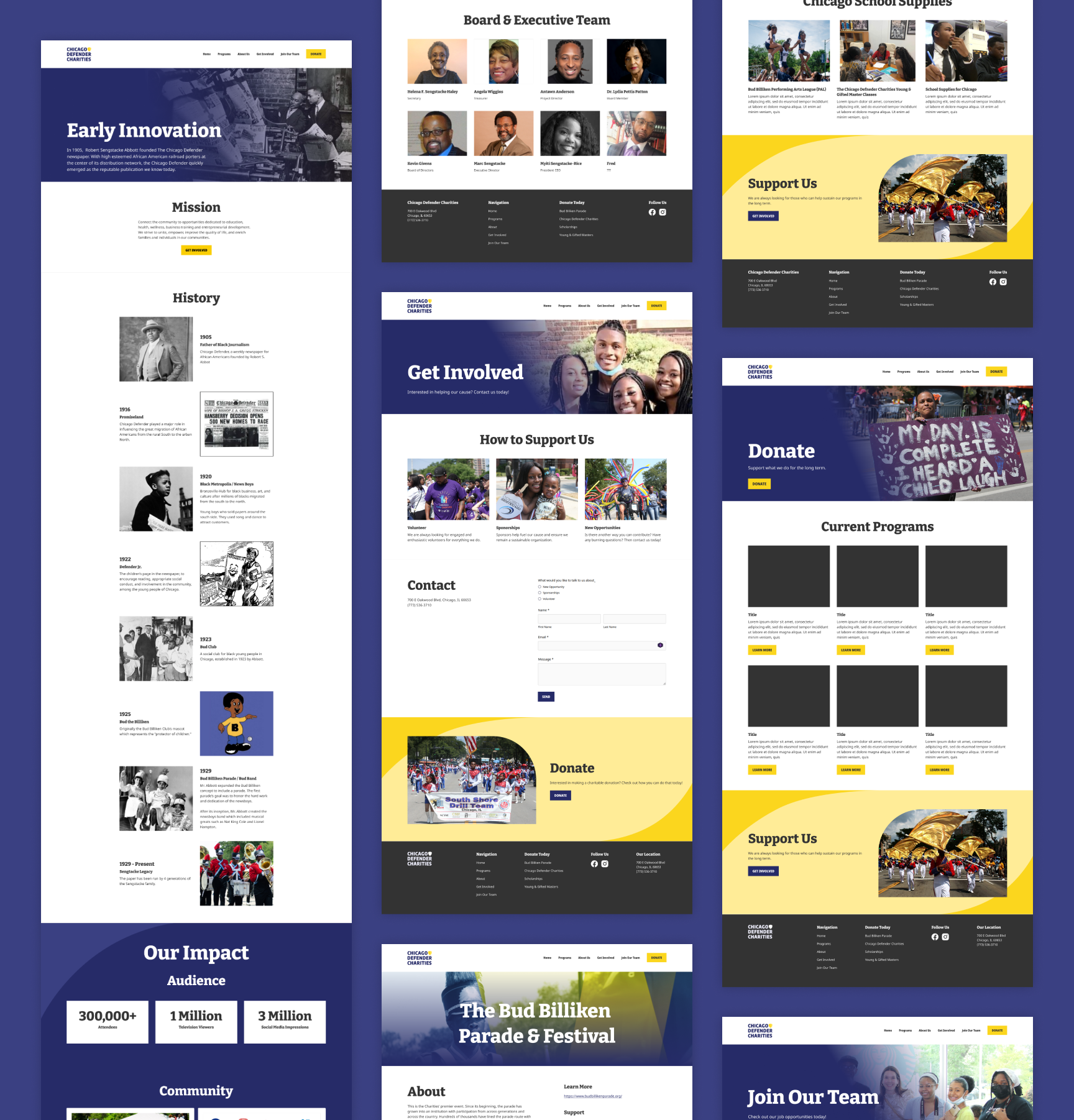
With these initial elements the team developed a set of graphics representing varying design directions. These were presented to the ChiDC team and with their feedback, the team further explored image styling, color, shapes, textures and graphic effects that would be used across the website. Ultimately, the team decided on the visual elements found in the three images seen here.
After finalizing the medium-fidelity wireframes the team used the initial design explorations as a guide to determine UI design. Over the course of two weeks, the designers styled multiple variations of the homepage.
During this phase the team refined the styling of buttons and photography, and further tweaked typography. The team determined where and how to apply the brand colors and developed graphic shapes that would emphasize specific sections of the site.
Finalizing the Website
During design’s early ideation and second research study, the development team facilitated technical research to identify the design limitations in Squarespace. This exercise helped reduce the amount of time later when designing the high-fidelity wireframes because the team worked within Squarespace’s constraints.
After facilitating the second research study, the team leveraged their findings to improve the website experience. Once these findings were implemented, the team leveraged the styling explored to design the high-fidelity wireframes. During this phase, it was determined where and how to apply the brand colors and developed graphic shapes that would emphasize specific sections of the site. The team developed multiple iterations of the homepage and then applied the approved styling to the remainder of the site.
The team capped off the end of this project with an in-person Meetup where they finalized the designs and handed off to development to build in Squarespace. This 1-day Meetup was a great way to talk through quick design decisions, and to further validate what was technically feasible in Squarespace.
Outcome
The team did an awesome job going through the full design process and working within the technical limitations for Squarespace.