Case StudiesCode for Chicago Website Redesign (Validation)
Validating the previous usability test's pain points

Overview
Code for Chicago
Code for Chicago is a subsidiary of Code for America with the goal of making tech accessible to everyone. Through Civic Tech, our work can bridge the gap between nonprofits and technology. Code for Chicago operates as a pro-bono digital consultancy. Code for Chicago identities the needs of the community and partners with local organizations for Civic Tech projects. These roles include, but are not limited to: Developers, UX/UI Designer and UX Researchers.
The Challenge
Findings from the Code for Chicago website usability test and interview identified some concerns. First, some users are unclear of the exact mission of Code for Chicago, who code for Chicago helps, and what the exact volunteer expectations are.
Approach
A series of remote moderated usability tests were conducted between February 28th and March 4th, 2023. These usability tests were conducted to test an updated prototype for a website redesign for Code for Chicago. The purpose of this research was to validate the findings of the first Code for Chicago Website Validation test as well as the Code for Chicago Interview Study.
Five participants took part in this test. Each individual session lasted approximately 40 to 60 minutes. In general, participants found the website to be logical and enjoyed the overall aesthetic. However, there are still some pain points in identifying project timelines and the overall onboarding process with this current prototype.
Project Timeline
February 2023 – March 2023
Problem Statement
The existing Code for Chicago website has some elements that are not explicitly clear to potential volunteers, which may deter individuals from joining the brigade.
Our Approach
Our team conducted 5 moderated Usability Tests and 1 Pilot Test with a high-fidelity prototype of the redesigned Code for Chicago website.
Test Development and Pilot Testing
A test-plan was created by the Meta Projects UX Research team. The test plan consisted of a problem statement, study purpose, scope, research questions, participant criteria, feature prioritization, logistics, test outline and script.
Recruitment
Participants were recruited through LinkedIn. In the post, potential participants were asked to fill out a short screener. If they met the screener criteria, they were contacted to coordinate a testing time. Participants also completed the online consent form prior to participation.
Who were the participants?
The required criteria was as follows:
- 18 years or older
- internet access
- must have an interest in the tech volunteer space
- have not volunteered for Code for Chicago within the last year.
We also outlined some preferred criteria in our research plan: People who have volunteered before but not for the Code for Chicago brigade, potential volunteers who haven’t heard of the brigade before and people interested in gaining tech-related experience. All of our participants met both the required and preferred criteria.
Usability Tests
The Usability Test was conducted to validate the findings of the first Code for Chicago Website Validation Test as well as the Code for Chicago Interview Study. This round of testing focused on three main areas: understanding the purpose and mission of the organization, how you can get involved with Code for Chicago and how you can volunteer for Code for Chicago.
Methodology
Meeting Format
The usability tests were conducted via Zoom with one moderator and at least one notetaker. The meetings followed the script as outlined in the test plan. Each usability test lasted between 40 to 60 minutes. The test included pre-test interview-style questions, 3 task scenarios that were completed through a website prototype in Figma and post-test follow-up questions.
Facilitation & Synthesis
At least one member of the research team took notes on each session, noting any problem areas during tasks, and pre and post test questions. After the completion of the 5th test, the research team created an affinity diagram and identified key insights, pain points and opportunities per participant per task. After identifying these key parts, the research team submitted final insights and recommendations by task. Each usability test was recorded so the entire research team could review the usability test.
Outcome
Based on the results of the usability test, the overall usability of the website seemed to be logical to participants. All participants liked the overall aesthetic and visual layout of the website. On the “About Us” page, we found that most participants are unclear of the distinction between Code for Chicago and Code for America. Some participants are still unclear how to define Civic Tech and had difficulty expressing their own definition of Civic Tech.
For the volunteer roles, most participants have a good sense of volunteer roles that exist within Code for Chicago. However, no participants were able to identify all three ways to be involved with Code for Chicago: donating, volunteering or being a non-profit partner.
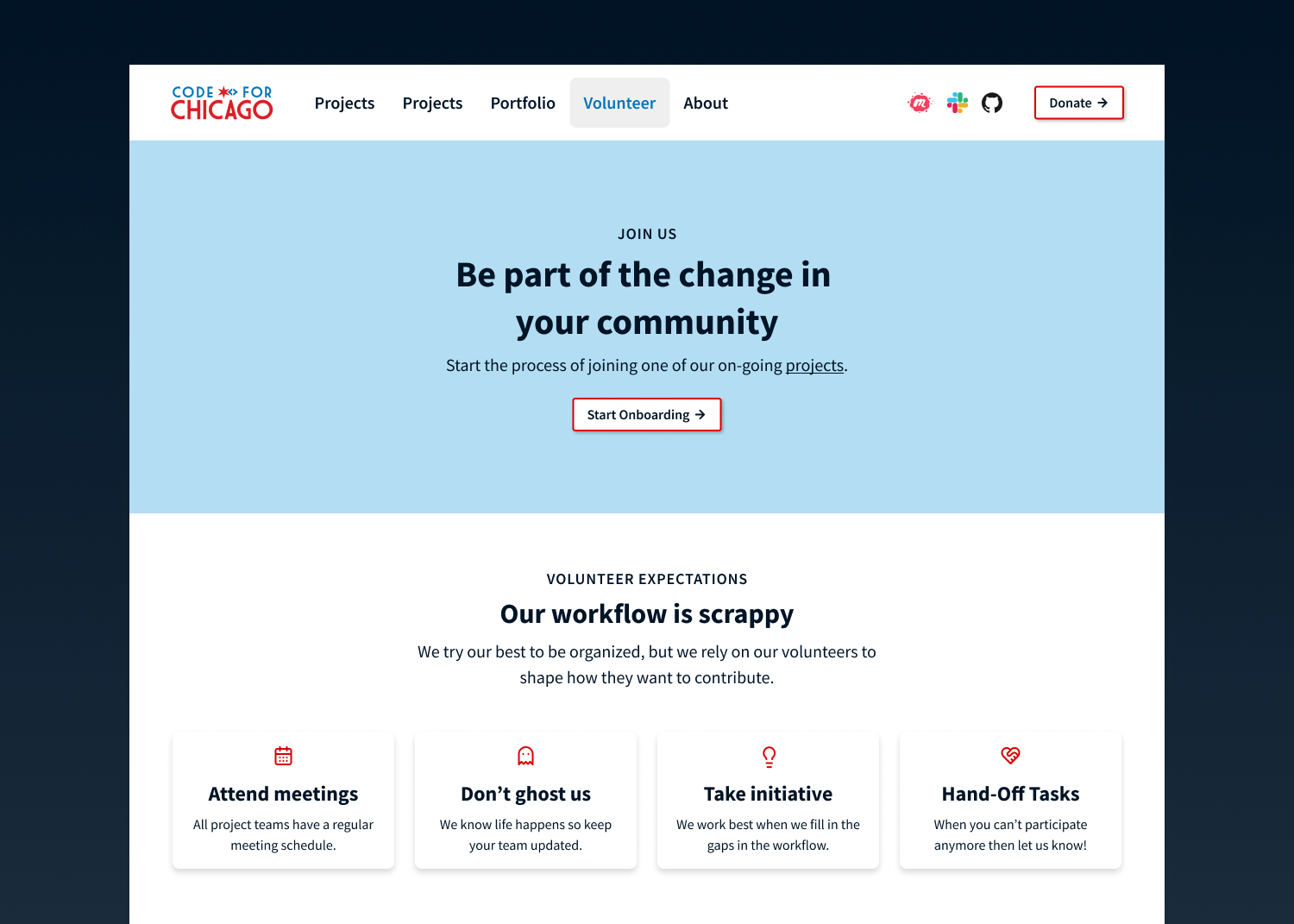
Participants enjoyed the project-specific page outlining volunteer roles and expectations. Many participants had a positive impression of the project description and expectations. However, exact time commitments are still unclear --for both recurring meetings and the overall project timeline.
Finally, there is consistent confusion around pre-onboarding tasks. The current dichotomous pre-onboarding + onboarding process is unclear. Page layout and order only adds to confusion and hinders volunteers from completing tasks in the desired order.
Recommendations
- Identify relationship of Code for Chicago to Code for America
- Define Civic Tech explicitly
- Communicate three ways to be involved with Code for Chicago clearly
- Clarify language around meeting cadence
- Simplify language around pre-onboarding and onboarding tasks to allow users to intuitively understand the first steps to joining Code for Chicago
Link to affinity diagram: https://miro.com/app/board/uXjVP81cL4U=/?share_link_id=575347694857