Case StudiesLegal Aid
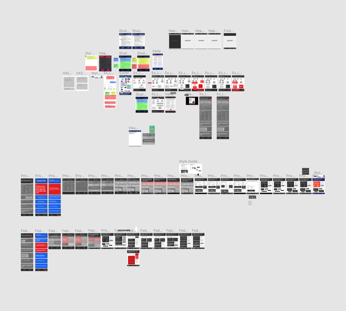
Redesigning of text heavy handout to an infographic
Overview
Client
Legal Aid is free representation in civil legal matters for clients who lack the resources to hire an attorney on their own. It is their vision that poverty will not be an impediment to justice in Cook County. Legal barriers that perpetuate poverty and inequality will be dismantled. Laws and legal systems will be open and equally effective for all who need their protection, especially those who experience unfair and disproportionately unjust treatment due to personal or community characteristics.
The Challenge
Redesign the current text heavy flyers into a more digestible infographic while still conveying the importance of the content and keeping within the design limitations/parameters
Approach
Code for Chicago approached the redesign from a top level standpoint, by breaking down the current flyer into what each content section of the flyer was conveying and prioritizing what was more important and what could be transferred digitally to the informational website
Project Month/Year:
June 2020
Problem Statement
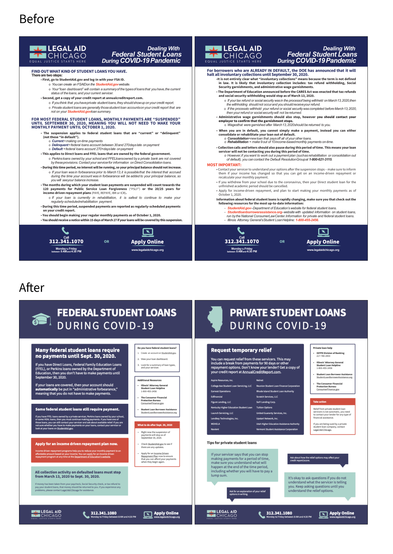
With COVID creating a surge of unemployment, people are becoming more financially concerned. One of their concerns is figuring out how to pay their student loans during this fiscally strapped time. Legal Aid’s current flyer design incorporated a lot of text that was not digestible in its current form - all the information was helpful but its overwhelming.
Code for Chicago was tasked with redesigning the flyers and facilitating conversations with Legal Aid in finding the balance of the information of what is important to convey on the flyer verses what can be referenced online via the flyer.
Our Approach
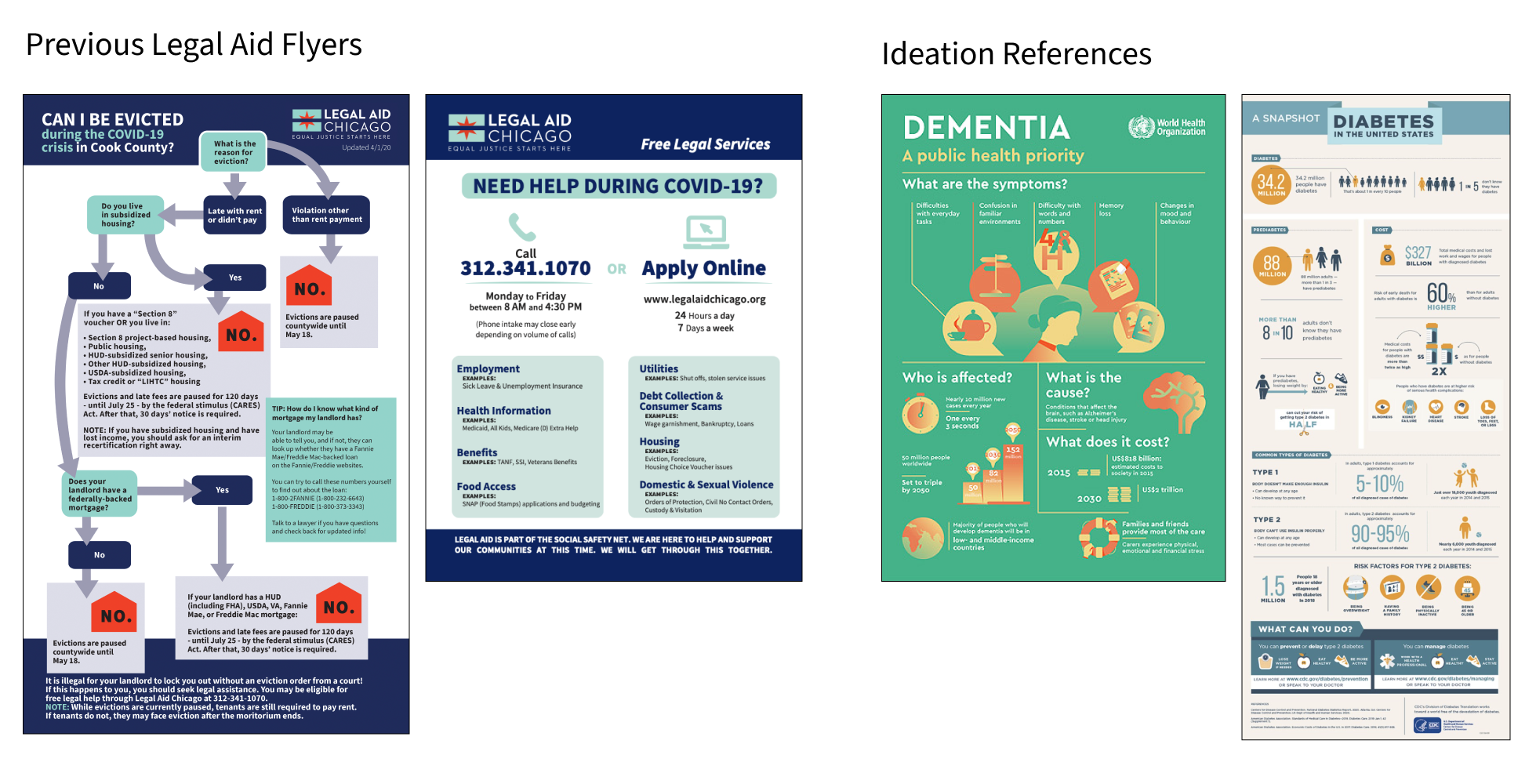
Based on the importance of what the flyer was trying to convey, stakeholder interviews were conducted with three lawyers within the organization. Legal Aid also provided previous flyers for inspiration and references to their styling/branding. From there, CfC worked on a top down approach by breaking down the flyer per what each section was trying to convey on a high level. With the interviews and the top down approach workshops were conducted throughout the ideation phase. Each week the team would meet and discuss each progression of the design of the flyer in a collaborative effort to ensure everyone was aligned on the design.
Methodology
Stakeholder Interviews
Stakeholder interviews were conducted and focused on gathering an understanding of what they feel was important to reference predominantly on the flyer in a cleaner form without all the heavy text.
What are the most important pieces of information?
- That this is something you can do while you wait.
- What can we do right now regarding forbearance?
- Are my loans paused right now because of COVID?
- Do I need to take any actions right now? Is this automatic?
Collaboration Workshops
In addition, the collaboration was hands on and design ideation meetings were held every week. Post every workshop action items were highlighted and utilized. Such as:
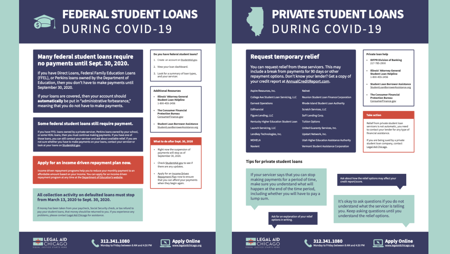
- Rationale for why we’re moving from a flow diagram to an informative one
- Decision to break the flyer up into federal and private loans
- Rearranged content from most to least important
- Went over each section and discussed the most important information we wanted to communicate
Outcome
Final outcome of the flyer was much more digestible and concise compared to previous.